
Color isn’t just an aesthetic choice; it’s a powerful psychological tool that shapes how people sense your brand. If you’re launching a startup or rebranding an established company, the colors you choose play an essential role in creating first impressions, stimulating emotions, and influencing customer choices. One of the key choices in this process is whether to go with neutral or bold colors. So, which approach should you take?
In this article, we’ll highlight the meaning and impact of neutral and bold colors, the pros and cons of each, and how to determine which suits your brand identity best.
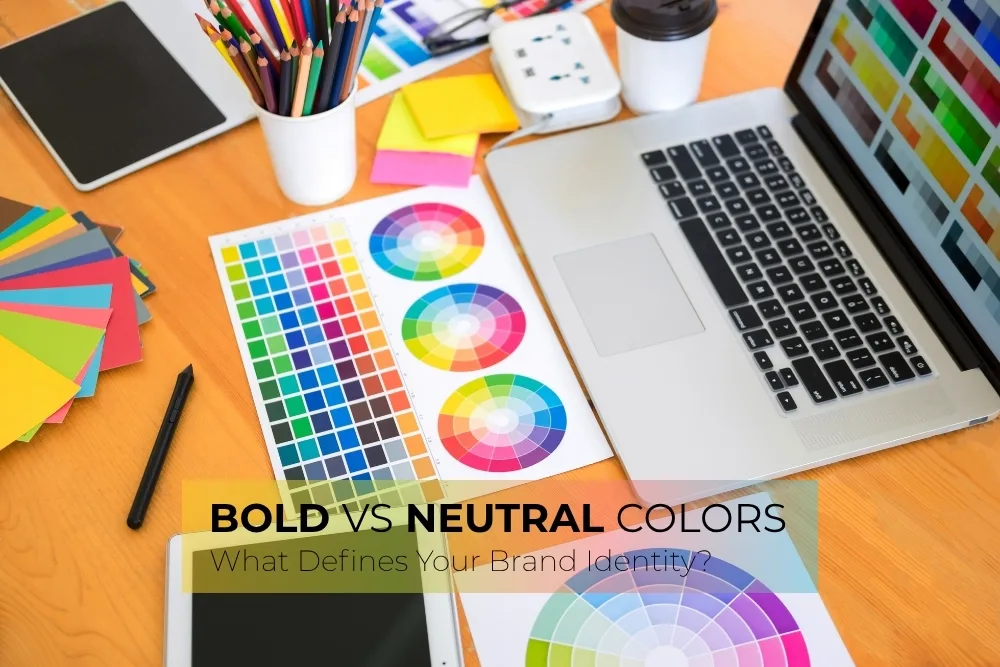
The Psychology of Color in Branding
Before discussing neutral vs. bold, it’s essential to understand why color matters so much in branding. Studies show that up to 90% of snap judgments made about products can be based on color alone. That’s because colors are deeply connected to emotions and connections.
For example, blue often conveys trust and reliability, making it a common choice for financial establishments. Red, on the other hand, creates urgency and excitement that is perfect for sales-driven brands. The key takeaway is this: color is not just decoration; it’s communication.
What Are Neutral Colors?
Neutral colors are those that don’t typically show up on the color wheel. They include shades like white, black, gray, beige, taupe, and sometimes muted tones like soft browns or warm greys. These colors don’t scream for attention, but they can create a clean, sophisticated, and classic look.
Characteristics of Neutral Colors:
- Minimalist and modern
- Often associated with professionalism and simplicity
- Ideal for backgrounds, highlights, or brand color schemes designed to adapt and grow over time.
Brands That Use Neutrals:
- Apple: Known for its clean white and silver tones, Apple’s brand identity leans on neutrality to highlight innovation and elegance.
- Chanel: With black and white as its primary palette, Chanel portrays sophistication and timeless style.
- LinkedIn: Uses a cool gray background to let its blue branding stand out without overwhelming the platform’s professional tone.
Benefits of Neutral Colors in Branding
1. Timeless Appeal
Neutral colors are rarely trendy, which means they don’t go out of style. Brands using them can maintain a consistent identity for years without appearing outdated.
2. Flexibility
Neutrals act as a blank canvas. You can easily combine them with seasonal colors, bold graphics, or vibrant calls to action without clashing.
3. Professionalism
If you’re a law firm or a high-end design studio, neutral tones often convey trust, authority, and refined aesthetics.
Drawbacks of Neutral Colors
1. Risk of Being Overlooked
Amidst heavy competition, a neutral brand can easily disappear into the background. If not designed with care, it may seem unremarkable or be quickly forgotten.
2. Requires Design Expertise
To avoid looking flat or clean, neutral palettes need great typography, imagery, and layout. Without these, the brand might lack personality.
What Are Bold Colors?
Bold colors are bright, saturated, and high-contrast. Consider red, blue, deep orange, neon green, and rich purples. These shades demand attention and are often used by brands that want to stand out, convey energy, or appeal to younger audiences.
Characteristics of Bold Colors:
- Energetic and attention-grabbing
- Produce strong emotions
- Reflect confidence, creativity, and modernity
Brands That Use Bold Colors:
- Coca-Cola: Iconic for its bright red branding that exudes excitement and warmth.
- Spotify: Their green logo against a black background creates a high-tech and youthful vibe.
- Lego: Bright red and yellow capture the brand’s playful and imaginative nature.
Benefits of Bold Colors in Branding
1. High Visibility
Bold colors help you stand out on shelves, social media feeds, and online marketplaces. They grab attention quickly—crucial for new or disruptive brands.
2. Strong Emotional Impact
These colors evoke emotion fast, whether it’s excitement, joy, or urgency. That emotional connection can drive customer engagement and loyalty.
3. Clear Differentiation
If your competitors are playing it safe with neutral tones, bold colors can help your brand carve out a unique identity.
Drawbacks of Bold Colors
1. Can Overwhelm
When overused, bold colors may feel loud or chaotic. Without balance, they can tire the eye or distract from your core message.
2. Trendy Risk
Bold hues may reflect current design trends. What’s stylish today might feel outdated tomorrow, requiring frequent rebranding or updates.
Choosing What’s Right for Your Brand
So, how do you decide between neutral and bold? It all comes down to your brand personality, audience, industry, and goals.
1. Define Your Brand Personality
Ask yourself: Is your brand clear and refined? Or vibrant and energetic?
- Neutral colors suit brands that are sophisticated, minimalist, and understated.
- Bold colors suit brands that are fun, disruptive, and dynamic.
2. Consider Your Target Audience
Who are you trying to reach?
- If your audience prefers peace and luxury, go for neutrals.
- If they’re young, energetic, or seeking excitement, bold colors will likely connect more.
3. Look at Your Industry
Some industries have understood the rules about color. For example:
- Tech and finance often lean toward neutral or cool tones (blue, gray, white).
- Fashion and cosmetics can go either way, depending on the audience.
- Food and beverage brands often use bold colors to spark cravings and capture attention at first glance.
4. Evaluate Longevity
Think about how long you want your branding to last. Neutrals offer a more evergreen appeal, while bold colors might need more frequent updates to stay present.
Can You Combine Both?
Absolutely! Many successful brands use a blend of neutral and bold colors to create visual balance. For example:
- Use a neutral background to let a bold logo pop.
- Pair bold accents with muted primary colors for a modern, approachable feel.
- Combine a neutral palette with bold typography or CTA buttons to direct attention where it matters.
This hybrid approach allows for flexibility while still creating visual interest and emotional impact.
Real-World Examples of Blended Palettes
- Google: The bold primary colors in its logo stand out against clean, white space across its platforms.
- Nike: Often uses neutral tones like black or gray, with bold colors used strategically in marketing campaigns or product lines.
- IKEA: Combines neutral environments with strong blue and yellow branding to maintain balance and high recognition.
There’s no one-size-fits-all answer when it comes to choosing between neutral and bold colors for your brand identity. Both options have their strengths and their challenges. The right color choice should reflect who you are as a brand, connect with your audience, and support your long-term vision.
If you’re looking for classiness, flexibility, and professionalism, neutrals might be the way to go. If you want to energize, determine, and make a strong visual impact, bold colors could be your best bet.
Ultimately, the most successful brands are the ones that use color intentionally, not just to look good, but to tell a story, create trust, and inspire action.